
- Cajon Pass: 1943 http://tinyurl.com/2qs8du #
- Has anyone else found that Lightroom won’t import CMYK images? You have to switch them to RGB in Photoshop first. #
- Stump Ranchers: 1939 http://tinyurl.com/35qyhn #
- Henry and Peter: 1911 http://tinyurl.com/3csyvx #
- Old-School: 1923 http://tinyurl.com/2cvq8s #
- Photo GPS Coming Soon http://tinyurl.com/22blng #
- How to Herd Organic Search Traffic to Your Blog http://tinyurl.com/2lqj25 #
- Working on a script for my upcoming video review of the SP560UZ. Recording the video today. #
- Monkey Boy’s three-legged race http://tinyurl.com/342snf #
- Manzanar: 1943 http://tinyurl.com/2tnvac #
- Microsoft Writes Yahoo: BoomTown Decodes the Letter, So You Don’t Have To! http://tinyurl.com/ypjfc3 #
- Penfield of Princeton: 1911 http://tinyurl.com/2a9xvn #
- Super Bowl: 1944 http://tinyurl.com/3cl54u #
Daily Archives: February 3, 2008
I miss Collier's Weekly
I know Collier’s has been gone for a long time, but when I see stuff like this, or this or this, I can’t help but love it. Maybe we should have more drawings in our magazines, and they should be done with the same classy style and atmosphere. Things are a bit too realistic nowadays. We can always get plenty of reality. We can’t avoid it. It would be nice to open a magazine and get lost in its own little world, where the articles, drawings, photos and yes, even ads are different from all the rest.
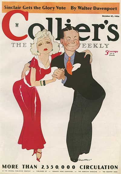
Image Credit: ASIFA-Hollywood Animation Archive
Such little thought is given these days to good cartoonists. Let’s not forget a good cartoonist made Harper’s Weekly what it was, and great artists gave Collier’s its look. Instead of getting celebrities to do provocative photo shoots on the cover — and to manipulate their looks into something completely artificial — it would be better to feature wonderful art like Collier’s did.
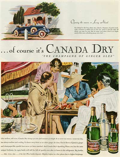
Image Credit: ASIFA-Hollywood Animation Archive
When we think class these days, fashion magazines come to mind. You open them up, and about 80% of those things are ads with lanky, weird-looking models sulking or posing awkwardly/provocatively. There’s very little substance, and very little interesting stuff. True class in a magazine is a style that comes through the page, and it’s about art, layout, colors, copy and yes, atmosphere. It should invite the reader to open it. While it deals with the problems of the world, it should be upbeat and entertain. Maybe I’m off the mark, but from what I’ve seen so far, I really do wish Collier’s could be resurrected, with the same style and panache of its heyday.
