Reviews

Google+ gets social networking right

On June 28 at 10:17 PM UTC, I got an invite to Google+ from Brian Rose (a Googler). I was in for a treat! 🙂

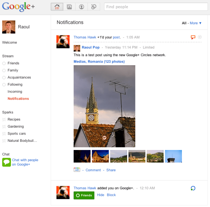
Here’s what the home screen looks like:

After multiple previous tries, I think Google’s finally got it with Google+. I’ve used both Wave and Buzz, and while they were interesting and innovative in their own ways, I just wasn’t drawn to them to the point where I wanted to use them multiple times a day, like I do with Facebook.

With Google+, I’m naturally drawn to the platform, because of its capabilities, and because of its design. I think Google finally bested Facebook.

Selective sharing and contact grouping

The feature I consider most important is Circles. The equivalent feature on Facebook is Lists, but there, it’s almost impossible to manage and use. On Google+, the platform was designed from the ground up around Circles, and this offers me the capabilities I’ve always wanted on a social networking platform:

  1. To share stuff selectively and privately, if I so desire, and do it effortlessly and safely. Facebook doesn’t do this. When you post an update, it goes out to everyone, and by that I mean all your contacts on that service.
  2. To easily group my contacts into categories. Again, Facebook doesn’t do this. There, you’re forced to Friend someone regardless of their relationship with you (online contact/person you barely know/acquaintance/actual friend/vip/business contact, etc.).

Here are a couple of screenshots from Google+ that demonstrate this.

I can’t emphasize enough how important selective sharing truly is on the web, and how refreshing it is to see it working so beautifully on Google+. The service even includes safeguards against accidental re-sharing of posts outside their intended group, with a feature that disables resharing. (I know you can still copy and paste or take a screenshot, but with this feature, you can indicate clearly to your contacts that you want that post to stay private. What they choose to do with it depends on their respect for you and your wishes.)

Gorgeous design

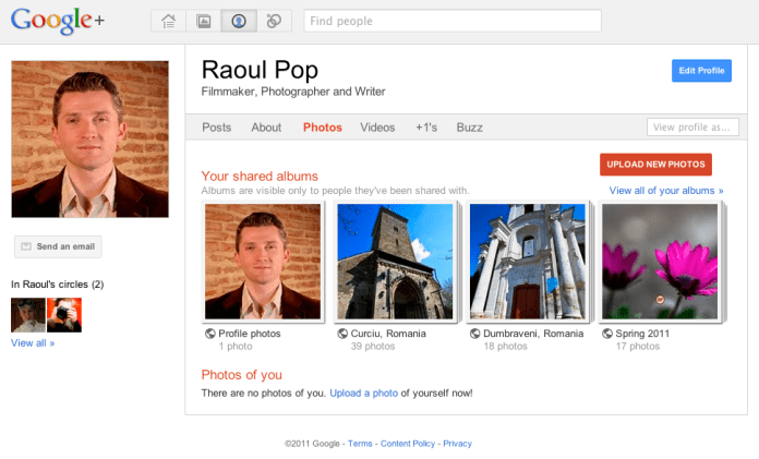
I’m floored by Google+’ gorgeous design. I love the whitespace, the clean color scheme, the layout and the button styles. I love that this same design now extends to my Google Profile, and to the photos posted to my PicasaWeb account. (Incidentally, isn’t it about time to change the name of PicasaWeb to Google Photos?)

All this design beauty makes me wonder where Google will stick the ads that will pay for Google+? I do hope they’ll use the same design philosophy for the ad boxes.

Instant video chat and topic-based web filtering

The other two important features of Google+ are Hangout and Sparks. Hangout is a super-easy group video chat, and Sparks gives you the chance to subscribe to topics of your choice, which then Google uses to filter the web and to present you with articles for your perusal.

Hangout is another fantastic (and sticky) feature for Google+. It builds on the power of Google Voice and Video Chat, which has been a feature of Gmail for years, and expands it to the point where you can chat with up to 10 people, live. This is going to be incredibly useful for families and (perhaps more importantly) for businesses. They’ll be able to hold web meetings instantly and easily now.

Sparks is a neat feature, but it still needs a bit of work. I’m not sure how the articles it presents are curated. And I get that you simply type in the topic you want, then click Add, but some (or most) people won’t get that. Perhaps a directory-like interface, where more choice and sub-choices are presented to people, will make it easier for them to use Sparks.

Areas of improvement

Right now, when I upload a video to Google+, it gets stored in a new album named after that day, in PicasaWeb. Same deal for new photos uploaded to the service.

This is the same approach used for Blogger. It’s a headache-free approach to handling media storage, but for those of us who have YouTube accounts, I’d rather have a choice of storing the video at YouTube instead of PicasaWeb. I want to manage all of my videos in one place instead of mixing them with my photos, particularly since I’m a YouTube Partner.

I’d also like to have the choice of storing uploaded photos in a gallery of my own choosing, or in a new gallery that I name myself. I think Google engineers will readily see the advantages of this without further explanation.

Where’s the integration with Google Docs? It’d be great if Google+ allowed easy sharing of documents from that service.

I like that you can’t auto-publish feeds to Google+, because it makes it harder for spammers to pollute the service. All of the input is manual, which means you have to physically be there and type it in. It does mean a bit of extra work after you’re written a blog post and want to share it. Perhaps some middle ground will be reached in the future, where blog posts, photos and videos will be automatically brought in.

That’s it for now. If I have further feedback, I’ll write another post. If you’d like to add me on Google+, here’s my profile.

Thank you Google, for the service and for the early invite! 
Standard
Thoughts

Mac Pro line overdue for a hardware refresh

Because of the recent hardware failure on my MacBook Pro, I started to think about getting a new computer.

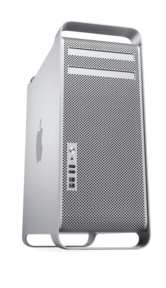
Given my intensive computing needs, I naturally looked toward the Mac Pro, but I was disappointed to find that its specs are lagging behind the times. The differences between it and what other Apple computers offer are enough for me to hold off on making the purchase.

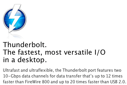
The areas where it needs to improve can (almost) be summarized by this screenshot:

Thunderbolt

The iMac already has Thunderbolt ports, but the Mac Pro (the top-of-the-line model) doesn’t. Why isn’t it there already?

If Thunderbolt is “the fastest, most versatile I/O in a desktop”, why is it MIA on the Mac Pro? Shouldn’t it be on Apple’s most powerful desktop? If it’s got 10 Gbps data channels, and it’s tens of times faster than FW800 or USB 2.0, why isn’t it on the Mac Pro?

It even made it onto the MBP… Will Thunderbolt make it onto the MacBook before it makes it onto the Mac Pro?

SATA 6GB/S

The Mac Pro’s internal architecture can support SATA 6Gb/s speeds. There are already SATA 6Gb/s hard drives on the market, at very affordable prices. Why doesn’t the Mac Pro, where storage bandwidth really matters, include SATA 6Gb/s technology? Why is it still stuck at SATA 3Gb/s?

USB 3.0

Where is USB 3.0 on the Mac Pro? It still only has USB 2.0 ports. I already have USB 3.0 peripherals, which I wouldn’t be able to use at their native speed if I got a Mac Pro.

Furthermore, where is USB 3.0 on any Mac? USB 3.0 is here to stay, it’s fast, and it’s on a lot of peripherals. It goes without saying that Apple needs to include it on the Mac Pro and on the rest of its computers.

What’s worrying is that Mac OS X Lion may not ship with support for USB 3.0, as this article suggests. No, no, no, Apple, please don’t do that…

30-inch Display

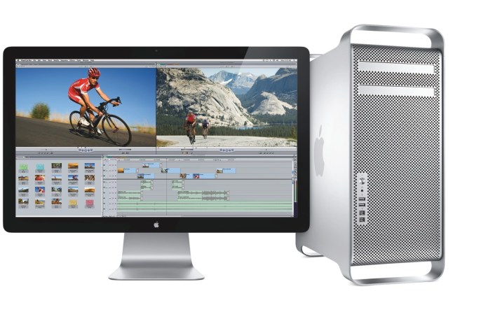
This is more of an annoyance, but it’s worth mentioning. Ever since it came out, I always dreamed of owning a 30-inch Cinema Display. Given some of the stuff I’m doing these days, I could really use it, too. But Apple no longer makes it. The only large display they make these days is the 27-inch Cinema Display, which is very nice, and it uses LED instead of LCD technology, but it’s not a 30-inch, is it?

Standard
Reviews

Once again, Apple design is best

I recently bought an Apple Battery Charger. It’s a diminutive device that charges two batteries at a time, within a few hours, and it comes neatly packaged in a paper box that can be easily opened. It does NOT come in that filthy plastic packaging that cuts you when you try to open it and takes up extra space. It comes in a rectangular package that can be stacked perfectly in boxes, taking up less space during shipping, storage and on retail shelves.

Now why can’t other companies do this? Why can’t they have smart design, instead of wasteful, stressful design? Have you taken a look at your battery charger lately? I have four other battery chargers from three different companies, and none of them are as well designed and thought out as the Apple battery charger.

It is clear to me that a lot of thought went into the design of the charger and of its packaging, much more thought than has ever gone into the design of another battery charger on the market. Somehow, Apple was able to fit the charger and six batteries into that little box.

Not only that, but there’s even a bit of empty space left inside, which was thoughtfully filled with a fold of the paper package, to ensure a snug fit for the batteries. Look through the round opening in the middle wall to see the top of the paper fold.

Did I mention the Apple Battery Charger works on both 120V and 220V current? How many other battery chargers do this? I brought a few chargers with me from the States, and they’re useless to me in Romania without a converter. Similarly, I bought a charger here, and it’d be useless to me back in the States, because it only runs on 220V current.

Once again I have to ask — why can’t other companies do this? I can’t help but admit out loud that almost anything else on the market appears crude when compared to Apple. It’s fascinating how much of an anomaly Apple is when you look at it this way.

Standard
Thoughts

Solar windows finally feasible

Back in 2004, I wrote about an idea of mine, to integrate solar panels into house or apartment windows, and thus help offset the cost of electricity. I’m glad to say it’s come to fruition. The technology to do this has been discovered. Granted, it’s still in the research phase, and the efficiency of these 1st generation solar windows is only 1.7%, but I’m thrilled to see that it’s a workable idea, and look forward to the day when we can purchase these windows from a store, presumably with a higher efficiency and a long working expectancy.

Richard Lunt, one of the researchers who developed the new transparent solar cell, demonstrates its transparency using a prototype cell. Photo credit: Geoffrey Supran and Cosmic Log, MSNBC.com.

Thanks to RAPatton on FriendFeed, who made me aware of this!

Standard
Reviews

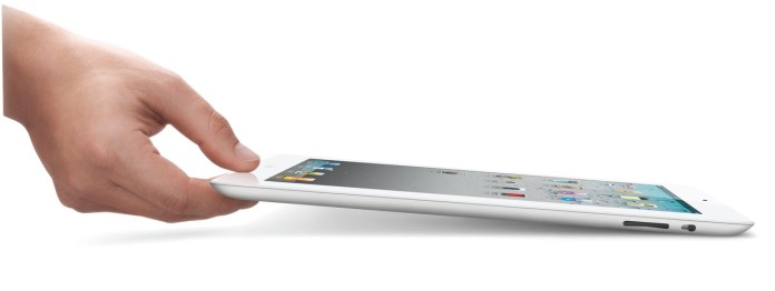
Hardware preview: Apple iPad 2

Apple iPad 2

The new iPad 2 will become available on March 11th (see a neat video from Apple introducing it). In my post about the original iPad, I said the following:

“In spite of the failures of their predecessors, I think Apple will pull this off. I think the iPad will be very successful.”

I’m glad to see that I was right. Not that I had anything to do with the success of the device. The credit goes entirely to Apple, and to the people who bought it and used it so well.

I got to watch the March 2 keynote today (a few days later). Much to my surprise, Steve Jobs was on stage to present it. I was very glad to see him able to stand up and hold a meeting, given all the tabloid rumors about him — though I have to say he was skinny as a board. Thank goodness he’s still around. I hope he gets better, and continues to be around for a few more decades.

Here’s a quick summary of the salient features of the iPad 2:

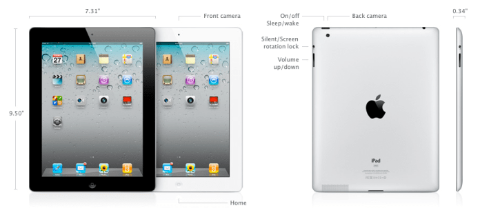
  • 33% thinner than the original iPad (0.34″), and lighter (1.33 lbs)
  • Comes in both black and white finishes
  • Dual-core A5 chip, up to 2x faster
  • Graphics are up to 9x faster
  • Same great 10-hour battery life
  • Same 1024×768 display
  • 2 cameras (front and back) for video or photos, in HD
  • Magnetic smart cover designed specifically for it
  • Instant on
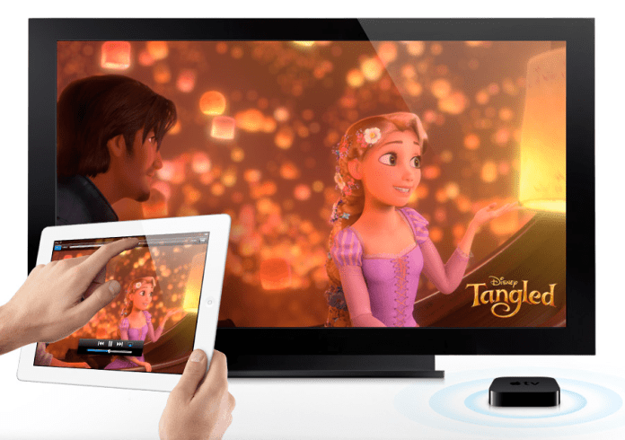
  • AirPlay to your TV via Apple TV
  • Video mirroring (up to 1080p) via $39 cable
  • AirPrint

My only disappointment with the iPad 2 is that it doesn’t have a Retina Display. Word on the grapevine is that they’re still difficult to make in that size. Who knows… It would have been nice if this iPad had it. Still, I believe iPad 3 will have a Retina Display.

iPad 2 Measurements

iPad 2 A5 Chip

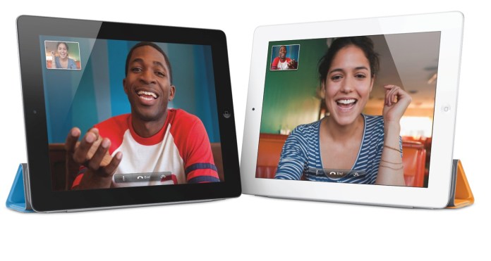
I am however very glad to see that the iPad 2 does have a video camera — and not just one, but two. In my review of the original iPad, I said this:

“It’s very likely the next gen iPad will have a video camera, and it will have iChat as well.”

Glad to see I was right on that count as well. It was, after all, a logical step.

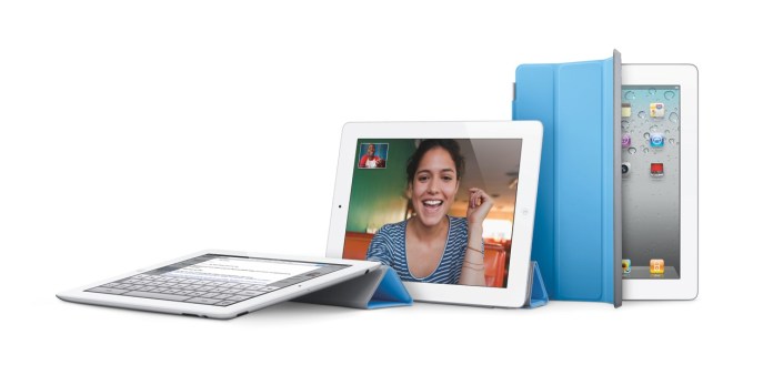
Facetime on iPad 2

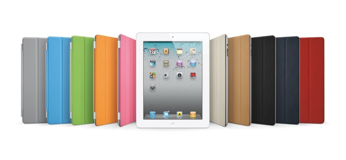
iPad 2 Smart Cover Line-up

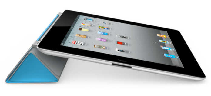
Smart Cover for iPad 2

There are some new accessories for the iPad 2, which will be offered in addition to the ones designed for the original iPad.

  • The Smart Cover, naturally, which comes in 10 colors, 5 of them polyurethane and 5 leather, as seen above (see the Smart Cover in action in this video)
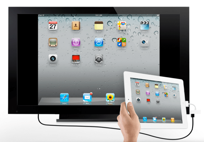
  • The Digital AV Adapter provides an HDMI-out port with video and audio routed to it, in addition to a 30-pin connector which lets you charge the iPad while playing content to an HDTV
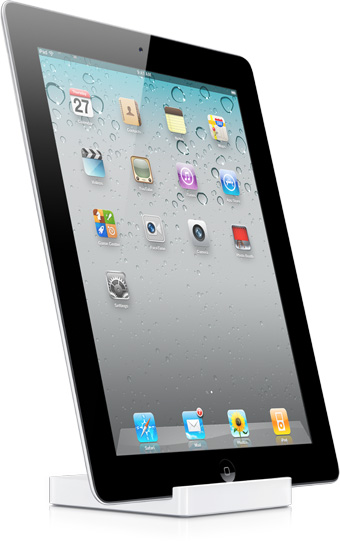
  • The iPad 2 Dock is designed for the thinner iPad 2, and also works with Digital AV Adapter

iPad 2 Dock

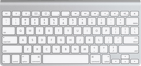
Of course, given that the iPad has Bluetooth, you can stick it in a dock and use the Apple Wireless Keyboard to type on it.

Apple Wireless Keyboard

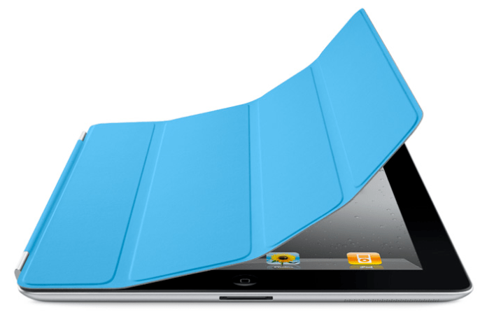
The Smart Cover is so nicely designed.

iPad 2 Smart Cover (1)

iPad 2 Smart Cover (2)

iPad 2 Smart Cover (3)

The Digital AV Adapter will make it so easy to display content from the iPad on an HDTV.

iPad 2 Digital AV Adapter

iPad 2 Video Mirroring

iPad 2 Airplay

The iPad 2 will come in 16GB, 32GB and 64GB models, as well as WiFi-only or WiFi+3G (GSM or CDMA) models. My guess is that iPad 3 will have a combined 4G GSM/CDMA chip, eliminating the need to offer separate 3G models. The pricing grid for the various models (there are 18 possible models, given that there are two color finishes and two 3G providers), goes as follows:

  • WiFi-only: $499/16GB, $599/32GB, $699/64GB (black or white finish)
  • WiFi + 3G: $629/16GB, $729/32GB, $829/64GB (black or white finish, AT&T/Verizon)

Images used courtesy of Apple Computer, Inc.

Standard