Reviews

Hardware review: Dell S2409W Flat Panel Display

The Dell S2409W 24-inch Widescreen Flat Panel LCD Monitor is a new model from Dell which has a 16:9 display ratio and runs about $350. Its native resolution is 1920×1080 pixels, which means it can display full quality HD content (1080p). It has three inputs: VGA, DVI and HDMI, which means you could connect it to your computer and to a DVD player or some other video device, and switch between the inputs as needed.

I purchased this monitor on 7/31, and it arrived on 8/21. My reason for buying it was the price. It is one of the lowest prices for a 24″ display from a reputable company, and I was also drawn to the 16:9 display ratio. I had a chance to work with it over these past four days.

I like the design of the monitor. It’s fairly thin in terms of depth, the rounded bezel is interesting, and the white power light is a very nice touch. It sits on a round base that has a sort of round indentation built-in, which I found to be a handy spot for post-it notes or a small remote control.

My computer setup is described in detail here. I have a MacBook Pro, and I do a lot of photography editing. As soon as I connected the S2409W to my MBP, I could see that fonts and curves weren’t displayed properly. There was some noticeable rasterization that took place at the edges of smaller objects on screen. I’m not sure of the word to describe it, but edges weren’t smooth, they were craggy.

I set up my MBP and the monitor in dual display mode, and I dragged windows back and forth between the two displays repeatedly, in order to compare the differences. As soon as a window made it onto the Dell monitor, things just didn’t look as good and as crisp as on my MBP’s display.

Also, no matter how much I calibrated it, I couldn’t get the contrast and brightness settings right. If the contrast was too low, then colors and shadows appeared washed out, and if the contrast was too high, the light-dark difference bothered my eyes. If I turned down the brightness, there was too little light on-screen, and if I turned it up, there was too much light, which made my eyes burn.

The next day, I brought my MBP into work and connected it to my Dell W2407WFPb monitor, another 24-inch flat panel display. This particular model belongs to the UltraSharp model line, which is higher quality. Here the colors showed up properly from the start, without calibration, and there was much less rasterization around the edges of letters and other small objects. I had to admit the S2409W display isn’t made as well as the W2407WFPb, which is understandable, since the latter model retails anywhere from $600-700.

I did one more thing: I started my XP VM on the Mac while connected to the S2409W, set it to full screen, and noticed that, at least when running Windows, the display quality was acceptable.

No matter how much I tried to adjust the display while I worked on my Mac, I couldn’t get it to work in a satisfactory manner for me. Since I do most of my work on a Mac and within OS X, the Dell S2409W won’t work for me, and I will have to return it.

Updated 8/28/08: You can read about my Dell return experience if interested. I find it very encouraging that Dell is now engaging with its customers the way they’ve done it after I wrote that post.

On a more general note, I haven’t been very successful with my monitor picks so far. I already tried using an HDTV as my computer monitor, but that didn’t work out. Now using a regular monitor hasn’t worked out either. It looks like I may need to spend upwards of $700 to get a good monitor that will work well for my needs.

Keep in mind that my needs are more demanding than those of the average user, and that I may be more critical of a monitor’s display quality than you may be. You may find the S2409W does just fine for you, particularly if you do most of your work on Windows, where it seems to work better. At $350 for a 24-inch display, it fits the bill as well.

Promotional: Shopping for Dell hardware? Use Dell coupon codes on your next purchase.

Standard
Reviews

A look at noise cancelling headphones

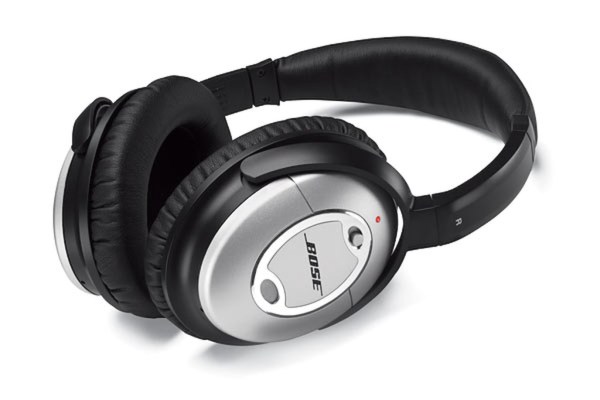
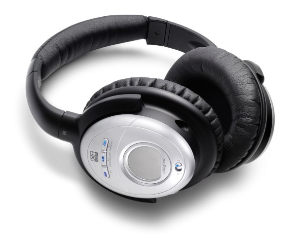
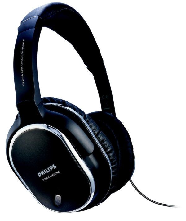
I’ve recently had the chance to try out three noise-canceling headphones:

I looked at these criteria as I used the headphones:

  • Effectiveness of noise-canceling technology
  • Quality of sound
  • Fit and comfort
  • Price

What may or may not surprise you is that all noise-canceling headphones block only low sounds, like the rumble of jet airplane engines. They do not block all sounds. They also rely on passive noise reduction, due to their around-ear design with thick cushions. In other words, don’t expect them to block all sounds, or you’ll be disappointed.

I only looked at around-ear designs, because I cannot stand on-ear designs. They make my ears numb after a half hour or so of wearing them. I need something that fits around my ears and doesn’t press down on them in order to get the comfort I need for prolonged wear.

One thing to keep in mind with around-ear headphones is that some will make your ears hot after a while. If care isn’t taken with the materials used in their construction, the heat that emanates from your ears will build up inside the headphone chamber and raise the temperature, making you uncomfortable. Heat and lack of air circulation are two things that will caused increased bacterial growth in your ears. Yes, this isn’t appetizing, but keep it in mind as you look at headphones and your own headphone-wearing habits.

All three of these headphones come with carrying cases, adaptors (2-pin and 6.3mm) and cables, so don’t let that be a differentiating factor. While I’m on this subject, keep in mind the Bose and Philips headphones only use one AAA battery while the Creative headphones use two AAA batteries. That is a differentiating factor.

Bose Quiet Comfort 2

The Bose Quiet Comfort 2 is priced at $299 and is the pricier of the three. There are more expensive noise-canceling headphones on the market (Sennheiser has a couple of more expensive models), but the Bose headphones are the most well-known of them all.

Its noise canceling capability was decent, but for the market leader, nothing special. It reduced the sound of jet aircraft, but all voices around me remained clearly audible, though just a little muted. I suppose I could describe the technology as elegant, since it allows one to carry on a conversation with someone while wearing the headphones, but I’m sorry, at $300 you ought to be able to adjust the level of noise-canceling in order to block as much or as little of the ambient noise as you want. They didn’t have that capability and disappointed me.

The quality of the sound was tinny. The noise-canceling technology did a number on the lower sounds coming out of the headphones as well, so everything sounded a bit like a tin-can telephone.

I could find nothing wrong with the fit. It was great. It didn’t press down on my ears, it didn’t press down on the top of my head, and the cushioning was just right.

Creative Aurvana X-Fi

These headphones retail at $249 currently, but beware, they’re still listed at $299 at Apple Stores. I have to say I was doubtful of Creative’s ability to offer great headphones, and also suspicious of their price point (frankly, they haven’t earned the right to charge $300 for headphones), and I was proven right on both counts.

The noise-canceling technology was very similar to the Bose QC2 headphones. Same comments apply, and the quality of the sound was just as annoying. I found that the noise-canceling button distorted the sounds significantly, much more so than the Bose headphones.

Creative added two buttons to the headphones, one called X-Fi Crystalizer, which is supposed to give detail and vibrancy, and X-Fi CMSS-3D, which adds spatial characteristics to the sounds. I sat at home for an entire evening, playing with the buttons, turning them on and off, trying to see what and how much the affected the sounds that the headphones produced. I found them to be gimmicky. They did nothing for me. Oh sure, they changed sounds slightly, but not enough to warrant their fancy names and the price of the headphones.

What really annoyed me was their fit and comfort. They pressed slightly on my ears, but their real crime was the quality of the materials used in their build. Within 5 minutes of wear, my ears got hot. Didn’t Creative do any real testing before releasing these? Who did they test them on? Any real person would have noticed that their ears got hot while wearing them, and would have said something.

Philips SHN9500

These headphones offer an equivalent level of noise-canceling technology. Having already explained how I feel about it, there’s no need to go over it again. I found the quality of the sound to be better than with the other two headphones. Quite acceptable, as a matter of fact, and it wasn’t severely affected when noise-canceling was turned on.

What I also liked was the presence of a Mute button on the headphones, which will turn off any sound coming through them, and also turn off noise-canceling. This allows you to hear someone better while you have the headphones on, without needing to remove them. You might say, well, why not just turn off noise-canceling? Because that’s a slider button, while the Mute button is a push-button with a very light action. Quite thoughtful on their part.

The fit and comfort of the headphones was another surprise. They fit nicely, and they’re made of quality materials. My ears do not get hot while wearing these, even for extended periods of time.

The biggest revelation for me was the price: $70 at Costco when I got them less than a couple of weeks ago. Now I see they’re $90 — they must be popular.

All in all, the Philips SHN9500 headphones have the right combination of features, comfort and price to make me happy. These are the headphones I would recommend to you.

More information

Photos used courtesy of Bose, Creative and Philips companies.

Standard
Reviews

Meet the replacement for .Mac: MobileMe

I mentioned in yesterday’s iPhone 3G announcement that Apple had secretly purchased the domain me.com for an undisclosed sum of money (in the neighborhood of 11 million). It came as no surprise to Apple fans when we found out that MobileMe was the replacement for .Mac. Users had griped for years about .Mac’s lackluster performance and puny space available (1GB for $99/year last I used it).

So, other than the new domain name (personally, I liked the .Mac domain), how’s the new service different?

  • More space: 20GB for the same price ($99/year for individuals and $149/year for a family pack). Additional space is $49/year for another 20GB or $99/year for another 40GB.
  • Push… everything: Apple has upgraded their .Mac email service and calendar and contact syncing to “push” technology. I don’t really see what’s different here when I compare it to .Mac, except the syncing is seamless and faster. And oh, now it works with PCs/Exchange as well.
  • Great web interface: Apple outdid itself here. .Mac had a web interface as well, but it was slow and kludgy. The new web interface behaves like desktop applications and looks really, really nice. Not sure how fast it loads on regular broadband connections, but we’ll find out soon, won’t we?

That’s about it, really. The bulk of the effort went into the better, cross-platform syncing and the innovative, beautifully-designed web interface. The additional space was long overdue.

Existing .Mac members will be upgraded automatically to MobileMe, and their existing subscriptions will be transferred over to the new service when it becomes available on July 11.

What’s the draw to MobileMe? For me, it’s the Back to My Mac service, which was introduced alongside iChat Screen Sharing in Leopard. It wasn’t enough to get me back when .Mac was overpriced and underfeatured, but it may be enough now that MobileMe has more space and is better designed. For iPhone users, it’s the obvious integration and contact/calendar syncing between the phone and the computer(s).

In terms of web storage space, the 20GB isn’t really that big of a deal for me. There are PLENTY of companies out there that offer more space. ADrive, for example, offers 50GB for free, and they’ve worked reliably for the past several months that I’ve used them. Dropbox, although it offers less space for free, has incredibly nice integration between Macs and PCs, and lets me share files seamlessly from computer to computer, or with my friends.

What I have to wonder about is Gmail. Given the partnership between Apple and Google, I’d have hoped that Google products would be better integrated into MobileMe somehow. It seems they’ve still been left by the wayside. They work, but not quite. I still can’t sync my calendar appointments properly from Gmail to iCal, and still can’t sync my contacts properly from Addressbook to Gmail (unless I have an iPhone or iPod Touch). Even Gmail’s IMAP interface in Mail leaves a lot to be desired. After using it for a few months, I switched back to POP3.

That’s annoying. I suppose it may have had something to do with Apple’s desire to keep building on their existing products and to develop an Apple-designed web interface (which is quite different from the spartan design of Google’s products).

Images used courtesy of Apple, Inc. More information about MobileMe can be found in Apple’s original press release, or on the MobileMe website.

Standard
Reviews

Hardware review: mStand by Rain

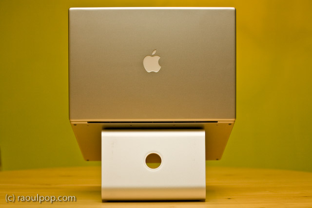
The mStand is quite possibly the best stand for the MacBook Pro line of laptops. It raises the laptop to an appropriate height, it does not block any of the MBP ports or buttons, its design is truly distinctive, its cast aluminum build matches the MBP line to a tee, and it is reasonably priced at $50.

I’ve tried out quite a few notebook stands in my time, and I’ve looked at even more of them in detail. I am happiest with the mStand. It suits my needs perfectly. However, it is not without faults, as you’ll see shortly. Its Apple-like design and look isn’t executed to the Apple standards.

First, the good:

  • Functional, simplistic and very elegant design
  • Although it is built of a single piece of aluminum, it will not scratch your laptop because it has little rubber contact points where your laptop rests on it
  • All aluminum build means it will dissipate your laptop’s heat fast.
  • The empty space underneath the stand aids with ventilation and also serves as a great place to store the external keyboard when not in use
  • The wire routing hole at the back of the stand looks very similar to the one on iMacs and Apple Cinema Displays and complements their design nicely
  • It blocks NONE of the MBP ports or buttons, such as the IR remote port, the latch for the top lid, or the SuperDrive slot. Of course, it does not block any of the side ports either, as you can see from the photos.

Now, the bad:

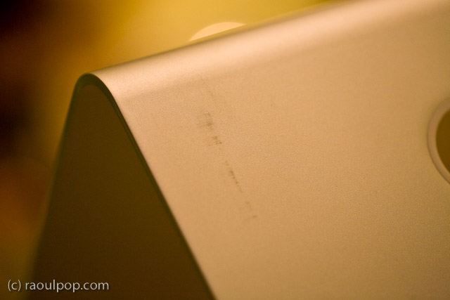
  • The paper (recycled?) packaging leaves terrible scuff marks on the stand, which mar its otherwise beautiful design and matte finish
  • The stand itself was covered in a thick white dust when I unboxed it, which caused significant sneezing. I hope it wasn’t harmful to my health, not sure what it was, and it sure didn’t look like regular dust.
  • The edges of the stand are not properly filed, which means they can be literally sharp enough to tear through one’s skin if you’re not paying attention. I had to use a metal file to finish the job they should have done at the factory.

Still, I think this is the best stand for my needs. As you may know, I already tried out the Logitech Alto and the Rolodex Stand, and had already tried other stands through the years, including the original Griffin Curve. I looked at vertical stands as well, like the Docking Stand from Power Support. But none of the stands offered unfettered access to all of the buttons and ports on the MBP, were as stable, and looked as good as the mStand.

While I loved the idea of the Docking Stand, it blocked access to the IR port, the latch button and the SuperDrive altogether, because the laptop sits top edge down in it. Putting the laptop in that stand the other way would cause some serious overheating to occur, since the venting grille is on the lid hinge side.

At any rate, I’m very happy with my mStand. In spite of its faults, which can be easily fixed through better quality control, it looks great and works great.

Standard
A Guide To A Good Life

My favorite pair of casual shoes

–> Updated: these shoes turned out to be terribly put together. The sole came apart from the shoe less than a year after I got them. I asked LL Bean to replace them, which they did. They sent me a new version of the shoes whose soles also came apart from the shoes about a year after I got that pair. So while they were comfortable to wear, their durability was terrible. Caveat emptor. 

I’ve been wearing a new pair of Keen shoes for the past few weeks, and I love them. If they haven’t got the showroom look in my photos, it’s because they haven’t been sitting in the closet.

I spotted them at L.L.Bean and couldn’t resist the design. They looked so comfortable and cool, up there on the shelf, that I had to try them on and get them. Indeed they are comfortable, even for extended walks, and they’re a lot of fun to wear.

One thing I should mention, if you care about that sort of thing: this particular design will make your feet seem smaller. I took a photo of one of my formal shoes next to one of my Keen shoes, just to show you the difference. Believe it or not, the formal shoes are slightly tight on my toes (length-wise, not width-wise). The Keen shoe looks smaller, yet my feet have no problems fitting in there.

While women may love having their feet look smaller, I understand that some men may not go for that sort of thing… Apparently foot size is associated with a certain other size in our vernacular. Personally, I’ve gotten over that, because I like these shoes a lot. Just thought I’d put that out there in case any of the women reading this are thinking about getting them for their significant others.

Standard