Places

The Watergate Hotel and the Kennedy Arts Center

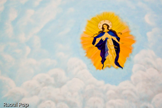
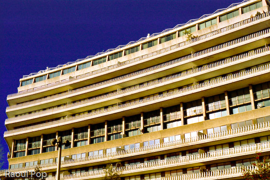
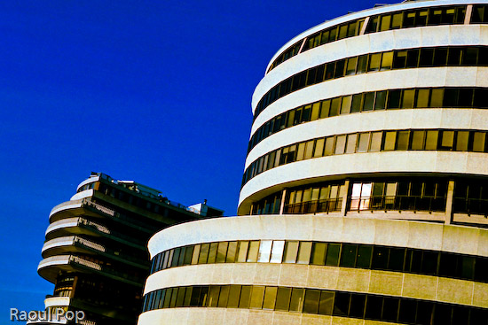
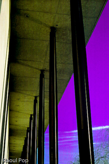
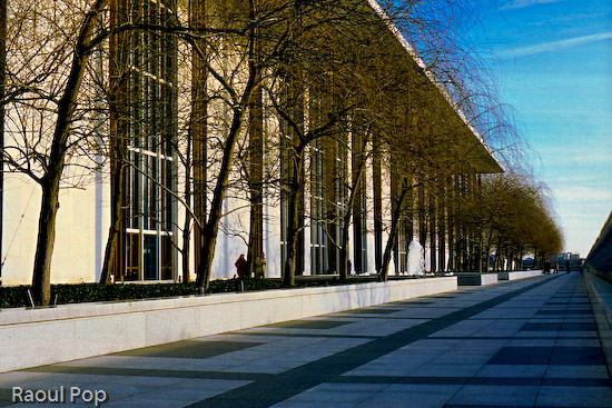
Back in February, Ligia and I plus good friends of ours took a photowalk through downtown DC. Our objectives: the Watergate Hotel and the Kennedy Arts Center. I used my Exakta EXA Ia to take the photographs. It was a lot of fun to use it, as always. I still love to shoot on film, even though it’s fairly expensive and time-intensive to get the photos in digital format. I say expensive because I’m used to shooting a LOT. I’m not satisfied with a few photos. I use up rolls of film during a session. Then I have to develop them and spend hours scanning them in. It takes about two hours to scan 24 exposures at the quality I want. And then I spend extra time editing them. But the results are worth it, and of course, the experience of using a fully manual, quality-built, metal camera like the Exakta is a treat in itself.

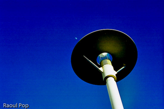
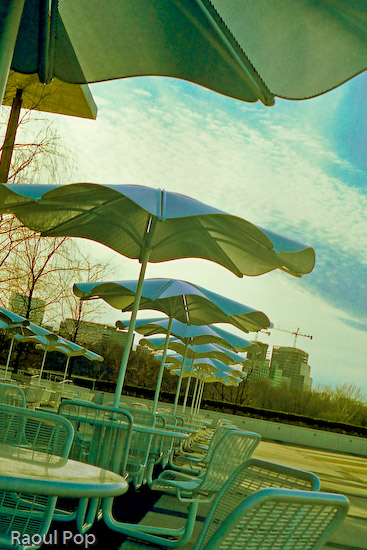
Here are a few photographs from that photowalk. We started down by the marina, walked up the street alongside the Watergate Hotel, then passed the Saudi embassy (which is quite an ugly building btw) and crossed the street to reach the Kennedy Arts Center. It was a cold, windy day and we froze, but I really like the photos I got, so it was worth it.

The Watergate Hotel

Political rhythm

Change of historical perspective

I see, you see, we all see

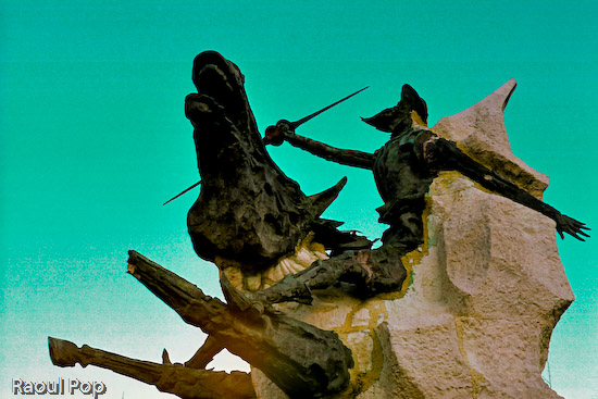
A modern interpretation of Don Quixote adorns the front of the Kennedy Center, and may I say what an ugly beast it is… Looks like whoever designed it was out to scare people, not inspire them.

He’s at it again

A clear day

Sit, sip, stare

Do, don’t talk

To scale

The day ended with a beautiful sunset over the Potomac River.

Potomac sunset

Standard
Events

Happy Easter!

This is a photo of the ceiling mural inside the chapel of Mount St. Mary University. Ligia and I were passing through the Maryland countryside on our way back from Gettysburg, we liked the architecture, and stopped to take photos. I have a ton more to postprocess, but really wanted to post this photo today since it’s Easter. The chapel was very dark and the camera couldn’t focus. I had to focus blindly, and as a result, the photo is soft. It’s also a bit noisy, since I shot at 1600 ISO. Just to round things out, I forgot my tripod at home, so I had to shoot handheld. But it gets the point across. Christ is risen indeed! Happy Easter!

Christ is risen!

Standard
Thoughts

The urge to splurge

I really like this photo I got with the E-500. It’s a statement about the American lifestyle, don’t you think?

Urge to splurge

Standard
How To

A bit about Wide Color Range and Lightroom

Those of you who follow my blog know I love color. I always look for ways to increase the intensity and range of the colors in my photos. I like to call it WCR (Wide Color Range). Who knows what it’s really called… Since I’m self-taught, that’s what I call it. I wrote recently about one of the ways I post-process my photos, and have gotten a lot of great feedback on that method. But it’s not suited to every situation. While it works very well for architecture, some nature, and even some portrait photography, the colors get to be too harsh in other situations.

So I started to experiment, and found that Lightroom is quite capable when it comes to achieving most of my post-processing goals. I really like the ability to make tonal and individual color adjustments without opening Photoshop. For example, I find Lightroom’s heal tool much easier to use than the heal tool in Photoshop. There’s a very practical reason for preferring to work in Lightroom as well, and it’s this: every time I transfer a RAW image to Photoshop, it turns into a 45MB file. Add an extra layer, and it doubles in size. That means every finished PSD or TIF file gets to be anywhere from 90-135MB or more. Compare that with 7-8MB for the original DNG file, and you can see how quickly hard drive space becomes an issue, particularly when a typical photo session of mine yields about 300-400 photos or more.

The key to using Lightroom (at least for me) is to be bold, to not be afraid of potentially ruining a photo. There’s always the reset button in case my results are off the mark. That means I can experiment all I want, non-destructively, which is hugely beneficial.

Here are a few of my recent results with Lightroom. In this photo, the sky was a fairly colorless light blue, though there were some tonal differences that allowed me to change hues and their intensity and really bring out the greens.

Green power

Here the sky was a light blue, but I wanted a different look, since I have tons of tree photos in my library.

Sensory perception

This was fairly simple, just slight vignetting with blue and green color enhancements, but I really like the result.

Windswept but steady

This one was a bit more complicated, with lots of tonal, hue, saturation and lightness adjustments. I really like how all of the trees are straight, spaced closed together, and yet still allow a nice view of the horizon. That’s why I photographed them.

Get up, stand up

There was no blood on the tracks in this photo, nor was there any red paint. There were some dark orange rust spots though. I changed their hue from orange to dark red in Lightroom, then increased that particular color’s saturation. Finally, I decreased that color’s lightness in order to darken it. In real life, those railroad tracks look perfectly normal, though rusty from a winter’s disuse.

Blood on the tracks

Standard
Thoughts

Aquatic dream

I really love how the colors came out in this photo. And this time I did it all in Lightroom. Call me a satisfied Lightroom customer.

Waterpaint

Standard