I’ve been intrigued by HDR (High Dynamic Range) post-processing for some time. At its best, it renders incredible images. At its worst, average, and even good, it renders completely unrealistic, overprocessed, unwatchable crud. Even some of the best images made with HDR methods seem weird. They’re not right — somehow too strange for my eyes. But, I did want to try some of it out myself and see what I’d get. The challenge for me was to keep the photo realistic and watchable. I wanted to enhance the dynamic range and color of my photos in an HDR sort of way. I also didn’t want to sit there with a tripod taking 3-5 exposures of the same scene. As much fun as that sounds, I don’t always carry a tripod with me.
By way of a disclaimer, I have not researched the production of HDR-processed images thoroughly. I have, however, seen a boatload of HDR images on both Flickr and Zooomr. I did read the tutorial that Trey Ratcliff posted on his Stuck in Customs blog. Of course, we all know Trey from Flickr, where he posts some fantastic HDR images on a daily basis. So, given my disclaimer, realize I don’t say I’m the first to have done this. I’m just saying this is how I worked things out for myself. If indeed I’m the first to do this, cool! If not, kudos to whoever did it before. I’d also like to encourage you to experiment on your own and see how things work out for you. Change my method, build on it, and make something even better. While I’m on the subject, I’m not even sure I should call this processing method HDR. It’s more like WCR (wide color range). What I’m really doing is enriching the color range already present in the photo while introducing new color tones.
When I started, I experimented with Photoshop’s built-in Merge to HDR feature. Using Photoshop, after a few non-starts that I deleted out of shame, I got something halfway usable. Have a look below.
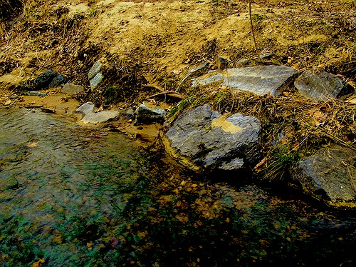
Here’s how I processed the photo above. I shot three exposures of that scene in burst & bracket mode, handheld (no tripod), in RAW format. Then, I darkened the low exposure, lightened the light exposure, and exported all three to full-res JPGs. Used Merge to HDR in Photoshop, got a 32-bit image, adjusted the exposure and gamma, converted to 16-bit, adjusted exposure, gamma, colors, levels, highlights, then smart sharpened and saved as 8-bit JPG. It came out okay — not weird, at least not too much, anyway, but still not to my satisfaction. I should mention I also used a sub-feature of the Merge to HDR option that automatically aligned the images. As I mentioned, I shot handheld, and there were slight differences in position between the three exposures. Photoshop did a pretty good job with the alignment, as you can see above. It wasn’t perfect, but definitely acceptable.
I know there are people out there saying Photoshop doesn’t do as good a job with HDR as Photomatix. It’s possible, although I got decent results. Maybe at some point in the future I’ll give Photomatix a try, but for now, I’m pretty happy with my own method — see below for the details.
But first, what’s the point of HDR anyway? When I answered that question for myself, I started thinking about creating my own (WCR) method. The point as I see it is this: to enhance the dynamic range of my images. That means bringing out the colors, highlights and shadows, making all of the details stand out. Whereas a regular, unprocessed photo looks pretty ho-hum, an HDR-processed photo should look amazing. It should pop out, it should stand out in a row of regular images. It should not look like some teenager got his hands on a camera and Photoshop and came up with something worthy of the computer’s trash bin. As I’ve heard it from others, the standard way to postprocess a scene in HDR is to take 3-5 varying exposures, from low to high. Those exposures can then be combined to create a single image that more faithfully represents the atmosphere and look of that scene.
But, what if you don’t have a tripod with you? Can’t you use a single image? Yes, you can shoot in RAW, which is the equivalent of a digital negative, and good HDR software can use that single exposure to create multiple varying exposures, combine them and create an image that’s almost as good as the one made from multiple original exposures.
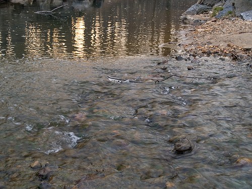
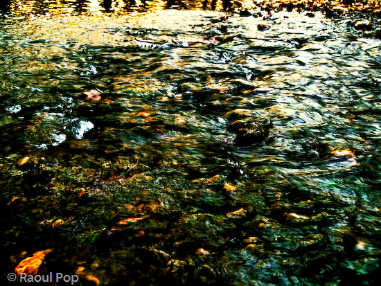
What if you want to make your own HDR/WCR images, in Photoshop, all by yourself? I wanted to do that, and I think I arrived at a result that works for me. Here’s what I did. I took a single exposure of a brook in the forest, which you can see below, unprocessed.

There’s nothing special about this photo. It’s as the camera gave it to me, in RAW format. The colors are dull and boring. There’s some dynamic range, and the color range is limited. It’s all pretty much made up of tones of brown. I took this single exposure, converted it to full-res JPG (but you don’t have to, you can use the RAW directly,) put it in Photoshop, created three copies of the original layer, called them Low, Medium and High, then adjusted the exposure for Low to low, left the exposure for Medium as it was, and adjusted the exposure for High to high. Then I set all of them to Overlay mode. (The original JPG, preserved in the Background layer, was left to Normal mode and was visible underneath all these layers.) The key word when talking about exposure here is subtle. Make subtle changes, or you’ll ruin the shot.
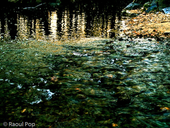
As soon as I adjusted the layers and changed them to Overlay, things looked a lot better. The dynamic range was there, it just needed to be tweaked. So I went in and adjusted the individual exposures for each layer some more to make sure parts of the photo weren’t getting washed out or ended up too dark. Then I threw a couple of adjustment layers on top for levels and colors. Finally, I duplicated the three layers and merged the duplicates, then used the smart sharpen tool. The adjustment layers were now on top of it all, followed by the merged and sharpened layer, and the three exposure-adjusted layers, which were no longer needed, but I kept them in there because I like to do non-destructive editing. Here’s the end result, exported to a JPG.

This is the sort of post-processing that pleases my eye. The details were preserved, the colors came out looking natural yet rich, and things look good overall. Even though some spots are a little overexposed, I like it and I’m happy with it. Let’s do a quick review. Using my own WCR/HDR-like method, I accomplished the following:
- Used a single RAW/JPG exposure
- Didn’t need to use a tripod, could shoot handheld
- Didn’t need special software, other than Photoshop
- Achieved the dynamic range I wanted
- The photo looks natural, at least to my eyes
- The post-processing was fairly simple and took about 30 minutes
There is one big difference between my WCR method and the usual HDR post-processing. Done right, the latter will help bring detail out of the shadows. Because of that single or multiple exposure done at +2 EV or more, spots that would normally be in the dark in a regular photo can be seen in HDR. Not so with my method. Here the darks become darker. The atmosphere thickens. The highlights become darker as well. The whole shot gains character, as I like to call it. So this is something to keep in mind.
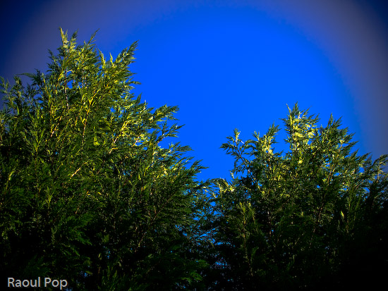
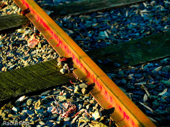
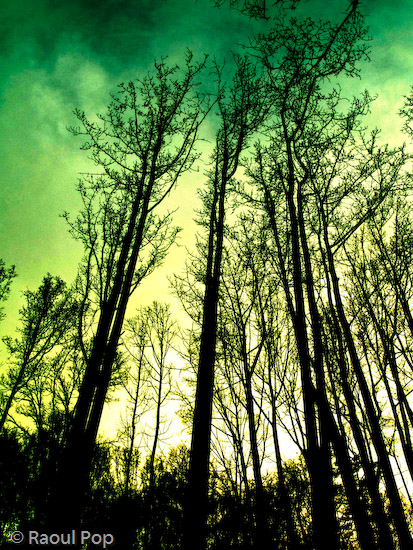
Just to clarify things, the image above was the first result I obtained using my method. There was no redo. I then processed some more images, and got a little better at it. It’s worth experimenting with the Shadow/Highlight options for each individual layer. It helps minimize blown-out spots. It’s also very worthwhile to play with the Filter tool for each layer. This really helps bring out some nice colors. It’s sort of like taking three exposures of the same scene with different color filters. The results can be stunning if done well. You also don’t need to use three overlays. It all depends on the photo. Some photos only need one overlay, while others need four or five. Subtle changes in exposure can help bring out areas that are too dark. You can see some photos below where I used my own advice.


I hope this proves useful to those of you out there interested in this sort of post-processing. It’s my dream to see more natural and colorful photos, regardless of whatever post-processing method is used.