Reviews

Windows Family Safety

Windows Family SafetyWindows Family Safety (WFS) is a new offering from Microsoft that aims to offer protection from questionable or indecent websites to families or individuals. I tried it out for a couple of weeks, and found it to work fairly well, except for a few hiccups here and there.

It is a software-based internet filtering mechanism. The difference between a software-based internet filter and a hardware-based one is that the software needs to be installed on every computer where filtering is desired. A hardware-based internet filter is usually self-contained in a box or appliance that gets placed between the user’s internet connection and the internet. The benefit of such an appliance is readily seen. There’s nothing to install on client computers. Unfortunately, hardware-based solutions have been fairly expensive, historically speaking.

Software-based internet filtering has also cost money, until now. As a matter of fact, Microsoft used to offer one such software-based solution with its premium MSN service. Windows Family Safety may be that same offering, repackaged as a free service.

Having used other software-based internet filters, I can tell you Windows Family Safety is a lot easier to use, and much less annoying than paid products. Those other services, who don’t even deserve to be called by their names, were just plain awful. I had to authenticate every time I tried to access a website, and logins didn’t even take at times. What’s worse, if a single website called out to other websites to display information, as is so common these days, I had to authenticate for every single request. They were a nightmare, and I quickly uninstalled them.

Windows Family Safety requires a simple install, and the selection of a master account which can set the level of access for that computer. It uses Microsoft Passport sign-ons, which means I was able to use my Hotmail account to log in. After that, it was a matter of logging in every time I turned on my computer or came back from standby. This was one area where I encountered a hiccup though. The software had an option to allow me to save my username and password, so I wouldn’t have to enter them so often, but that option didn’t seem to work. I was stuck logging in much more than I cared to do, but still, this was nothing compared to the torture I went through with other software-based filters — as already mentioned in the paragraph above.

Just how does WFS work? It turns out that it uses a proxy to filter the traffic. It means that every time you make a call to a website, that call first goes through the WFS servers, where it gets matched to their content database and the website deemed to be appropriate for the level of safety that you’ve chosen. Here’s where I encountered two hiccups.

The first was that at peak times, the speed of my internet connection was slowed down to a crawl until it could pass through the fairly busy proxy servers and be filtered. That was really annoying, but I assume that’s going to get better as MS dedicates more proxy servers to the service. Perhaps it might be better to download content filters directly to each computer and filter the traffic locally, so the chance of a bottleneck is reduced or eliminated.

The second was the seemingly arbitrary designation of some sites as inappropriate. I chose to filter out adult, gambling and violent websites. Somehow, both of my blogs (ComeAcross and Dignoscentia) didn’t meet that standard, which was very surprising to me. Neither of those sites can even remotely be classified under those questionable categories. Fortunately, there’s a fairly simple process for requesting that a site be reconsidered for proper classification, and it’s built into the Windows Family Safety website. I followed the procedure, and within days, my sites were properly classified. But the fact that I had to go through all of that makes me wonder how they’re classified in the first place.

Overall, I found that WFS still hasn’t gotten proper branding. What I mean by that is that it’s not clearly identified as a product by Microsoft. The Windows Live OneCare Family Safety website is part of the Live Family of sites, true, but it’s not even identified on most of the other sites in that family (Hotmail, SkyDrive, etc.) I also found that configuring one’s WFS account can be pretty unintuitive, as the navigation on the WFS site is cumbersome and lacking focus (much like the Windows Live OneCare site, come to think of it.) I even got code errors when I tried to surf through it recently, which is not what I expected from a public MS site.

On a general note, Microsoft really needs to do some work in associating each MS product with the Windows Live account that uses it, and making it easy for each user to access the online/offline settings for each product. Google does a great job with this, and MS could stand to learn from them here.

Windows Family Safety is a good solution, and it works well considering that it’s free. If you’re looking to set up some easy internet filtering at your home, it could turn out to work great for you. Give it a try and see!

Standard
Thoughts

Photography, take two, part two

I continued to work on replacing photos hosted with third party services. The list of modified posts is provided below. This has proven to be a huge effort. I had to locate the photos in my digital library — not all of which is keyworded yet, though I’ve got location information for all my photos — but I also chose to re-process, keyword and re-title the photos. You see, most of these photos were keyworded through bulk uploaders, for the purpose of displaying that data on third party photo sharing sites, not for my own library. Clearly that effort was wasted, but I didn’t know that back when I did it… Where applicable, I am also re-writing some of the text.

I want to make sure that the content I provide here at ComeAcross is truly top tier, as much as possible. What does that mean? Well, it means I spent my entire weekend, including Monday, working on the posts listed below, and on the posts listed in part one. I still have more posts to go. I don’t mind doing this — actually, I look forward to it — but I do hope that you, the reader, appreciate the effort that goes on behind the scenes. 🙂

Also see Photography, take two, part one.

Standard
Thoughts

Photography, take two

Over this weekend and the last several days, I’ve gone through posts that contain photographs, and replaced all of the images with ones hosted directly at ComeAcross. In the past, I’ve used photos hosted with third party photo sharing services, and I realize now that’s a folly.

If a third party service goes down, which is very likely with beta services, my photos become unavailable. Even if that service is not in beta, a simple action like closing one’s account shuts down access to all of the photos uploaded there. It’s much more practical to host the photos together with my website. That way, I am fully responsible for making sure that all of my content is accessible. If something goes down, I can take care of it. If I need to change web hosting providers, I simply transfer all of my files over to another server.

It’s not as simple to transfer one’s content with photo sharing services, no matter what they may promise. Image and meta data portability is still not 100% there, and it doesn’t help when a photo sharing service advertises their API’s availability for more than a year, yet fails to put it out for public use. It also doesn’t help when said portability is rendered useless by the amount of compression used on the uploaded originals, or the deletion of meta data embedded in the originals…

You see, everyone is ready to promise the world to you when they want to sell you on something. Quite often, that “world” is nothing more than an empty little shell. I speak in general terms here, from the things I’ve learned through my various experiences — mostly recent ones…

At any rate, I’ve still got to modify a number of posts, but I thought I’d point out the ones I’ve already worked on. They’re quite a few, and I’m happy with the results so far. Here they are:

Also see Photography, take two, part two for more updated posts.

Standard
Reviews

Lens comparison: EF 24-70mm f/2.8L Zoom vs EF 24-105mm f/4L IS Zoom

Have you ever wondered how the EF 24-70mm f/2.8L and EF 24-105mm f/4L zoom lenses would do if compared side by side? Which one would come out as the winner in real-world use? Here’s my answer to that question.

First, some recommended reading:

Those two reviews of mine should give you a good idea of what each lens can do. Now let’s talk about how they do when they’re together. 🙂 Here’s a photo of the two lenses. As you can see right away, the 24-105mm is smaller in both height and girth — it’s shorter and a little narrower than the 24-70mm.

When we look at the rear lens elements, we can see some differences there as well. The 24-105mm lens is on the left. If you look carefully, you can see a baffle in place. The 24-70mm lens has no baffle.

It’s possible that the baffle is there in order to reduce possible flare effects, since the focal range is longer. It could also be there to baffle us — after all, it is a baffle. 🙂 It’s also possible that the optics aren’t as high quality as those in the 24-70mm lens — they’re both priced the same, but the 24-105mm has image stabilization and an extra 35mm of range. On the other hand, I’ve seen a very similar baffle on the EF 14mm f/2.8L prime lens, and no one can say that the 14mm lens is made with cheap glass. So the more likely explanation is that it’s there to reduce lens flare due to the increased focal range.

(By the way, the baffle can be seen even more clearly in this product advisory from Canon warning about unacceptable levels of lens flare in early builds (2005) of the 24-105mm lens.)

Here’s another look at the lenses side by side, this time with the lens controls visible. As you can see, the only thing that’s different on the 24-105mm lens is that it’s got the IS switch. The controls seemed a little thicker on the 24-70mm lens. As for their durability, I assume they’re both long-lasting since these are L series lenses.

Chances are you can already know that the 24-105mm lens is lighter than the 24-70mm lens. It’s no small difference, by the way. The 24-105mm lens is 670g, while the 24-70mm lens is 950g — that’s 280g of difference! While both lenses extend outward as you zoom, the 24-70mm lens is more top-heavy than the 24-105mm lens, and that makes a big difference in wrist fatigue — the 24-105mm lens is less punishing and can be held comfortably for longer periods of time.

The weight difference is remarkable to me because the 24-105mm lens has 18 elements, while the 24-70mm lens has 16 elements. Canon managed to keep the weight down even though they placed extra glass in there and added image stabilization.

There are some limitations to being lighter and smaller though. The 24-105mm lens’ closest focusing distance is 1.48ft or 0.45m, while the 24-70mm lens’ closest focusing distance is 1.25ft or 0.38m. It also looks like the general consensus is that images obtained with the 24-105mm lens are somewhat softer than those obtained with the 24-70mm lens.

Other than the difference in focal lengths, another obvious difference between them is the maximum aperture. The 24-70mm lens opens up to f/2.8, while the 24-105mm lens only opens up to f/4. That’s a full f-stop difference, or a 2x reduction in the amount of light that can enter the lens. This is where the baffle comes in again. Since the baffle itself limits the amount of light that can hit the sensor in order to reduce glare, it stands to reason that the aperture can’t open up any wider. Even if it did, we’d end up seeing the baffle contours in our photos.

What the 24-105mm lens has going for it is the built-in image stabilization, which, in my experience, more than compensates for the reduced maximum aperture. See the photo below. I took it completely handheld (I didn’t prop myself up against anything) at a shutter speed of 1/15th seconds.

I tried to get similar photos with the 24-70mm lens, and I couldn’t, not without leaning against something to stabilize the lens. The slowest shutter speed I could use was 1/30th seconds with that lens. As I concluded in my previous review of the 24-105mm lens, the image stabilization counts for a lot and makes the lens truly versatile and useful.

While I’m talking about versatility, let’s not forget that extra 35mm of focal range. At close distances (6-15 feet), you don’t notice how much it matters, but when you start focusing on things farther away (30-100 feet or more), you realize how valuable those extra millimeters really are!

Let’s not forget bokeh. Both lenses have gorgeous bokeh, but the 24-70mm produces a creamier bokeh. That’s because it opens up all the way to f/2.8, while the other only opens up to f/4. If you do a lot of close-range photography, in tighter spaces, and you really need that bokeh (portraits, etc.), the 24-70mm would probably be a better candidate. This next photo was taken with the 24-70mm lens.

If you’ve got a little wiggle room and can position your subjects further away from things (walls, trees, background), don’t discount the 24-105mm lens. Its bokeh is right up there with the best of them. Have a look below.

In the end, it really comes down to your own, precise needs. I’ve heard of some people who only carry two lenses in their bag: the 24-70mm and the 70-200mm (both of which I reviewed here). They’re both professional-grade, L series lenses. They’re heavy, but they deliver the goods, and they’re versatile.

For my needs, I’d go with the 24-105mm lens. It’s lighter, has extra range, and has built-in image stabilization. I really enjoyed using it, and I seemed to get better photos with it than with the 24-70mm zoom. While it may not be as sharp, I didn’t notice anything that would turn me away from using it. I thought it was a superb lens and couldn’t believe the quality of the optics when I looked at the photos I got with it.

At least one commenter here asked how these two lenses compare, and I hope that I’ve answered that question in as much detail as I could give. If you have any other questions, pose them in the comments on this post, and I’ll try to answer them.

More information:

Standard
Thoughts

Something happened to ComeAcross

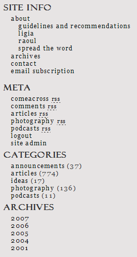
Something really good, that is. Over the weekend, I worked on improving the site functionality and on presenting a unified front, so to speak. I eliminated some sections, created some new ones, deleted tons of categories, and introduced some new feeds. The best way to explain it is to show you a screenshot of the sidebar. Have a look at it, then scroll past it to read the details.

The new ComeAcross sidebar

First, let me explain why. The gist of this effort is simple, at least to me. I’m trying to build an online brand, and it’s no good to have my online properties looking scattered and isolated, even when they’re part of the same brand. Second, I needed to value my work a little better, and to present it in ways that are easier to digest. I have a ton of content, but it’s not easy to find. I write on many subjects, but most people aren’t necessarily interested in all that I write. Add to that my constant lament about having too many categories, the release of WP 2.3 which allowed for native tagging, and finding John Godley’s awesome Redirection and Headspace plugins for WP, and it all adds up to some serious blog work that I’d been aching to do for some time.

You may remember I had other site sections just a little while ago, sections such as Blog, Photos, Videos, Podcasts and Faves. Those were located on individual sub-domains. ComeAcross resided under Blog, my photos posted to Flickr or Zooomr resided under Photos, and my videos posted to Vimeo or YouTube resided under Videos. The ComeAcross Podcasts resided under Podcasts, and I was using a podcasting platform called Loudblog to publish them. The Faves section displayed my Shared Items from Google Reader. But the problem was that all of these sections were separate. They were part of the same brand, but to search engines, they were different properties. I needed to bring all of my online content under one fold. I decided to do away with all of the subdomains and integrate everything into my blog, and that’s just what I did. I thought long and hard about this, and realized it was best to have everything under one roof, even though that meant my podcasts wouldn’t have a dedicated podcasting platform.

You’ll notice I’m advertising multiple feeds in the Meta section. I’d been sitting on some really good feed URIs from FeedBurner and not really putting them to good use. After re-categorizing my posts, I was able to re-dedicate those feeds to the my various categories, in order to allow you to subscribe to whatever interests you. I’ve got the main site feed, the comments feed, the articles feed, the photography feed, and the podcasts feed. It adds up to more choice for the reader. Incidentally, mouse over the articles and photography feeds, and look at the URIs. Isn’t that awesome? Can you believe I actually have those URIs? 🙂

Related to the feed changes mentioned above: my apologies to anyone currently subscribed to the following feed: feeds.feedburner.com/Information. I’ve been using it for my podcasts, but changed my mind and decided to use it for my articles instead. I know there were some diehard subscribers who stayed with that feed even though I put out no new podcasts in over a year (!), and they’re probably pretty confused right now. If you’re one of those, many thanks for sticking with me, and I’m sorry for switching content on you like this. The new feed for my podcasts is: feeds.feedburner.com/Raoul-Podcasts. And yes, in case you’re wondering, I’m working on a new podcast which I’ll put out soon (this month). 🙂

This brings me to the Categories. At some point, I had over 60 categories for my posts. What I was really doing is using categories as tags, and I shouldn’t have done it. After upgrading to WP 2.3, I decided to use categories as categories and tags as tags. I deleted almost all of my categories, and ended up with only five: articles, photography, podcasts, ideas and announcements. Now each one of my posts goes into only one category. Since I’m using tags as well, you can explore ComeAcross via categories, then click on the tags that interest you to get only the posts that you want. (I haven’t tagged all of my posts yet, that’s an ongoing process. I’m also displaying a tag cloud at the bottom of the sidebar, but I’ve got to work on the formatting of that text. I’m not quite happy with how it’s getting displayed. )

Finally, have a look at the Archives section. This is a small change, but it makes a big difference to the reader. I’m only displaying the years for my posts. This allows you to get a better idea right away of the spread of my content, and to explore the time period that you’d like to see. I still need to do some work on Archive and Category browsing, and on the Search results page.

I’m constantly working to improve ComeAcross, because I really want it to grow into a useful, well-read source of information. Here are just a few of the posts that talk about other changes and progress I’ve made:

Standard